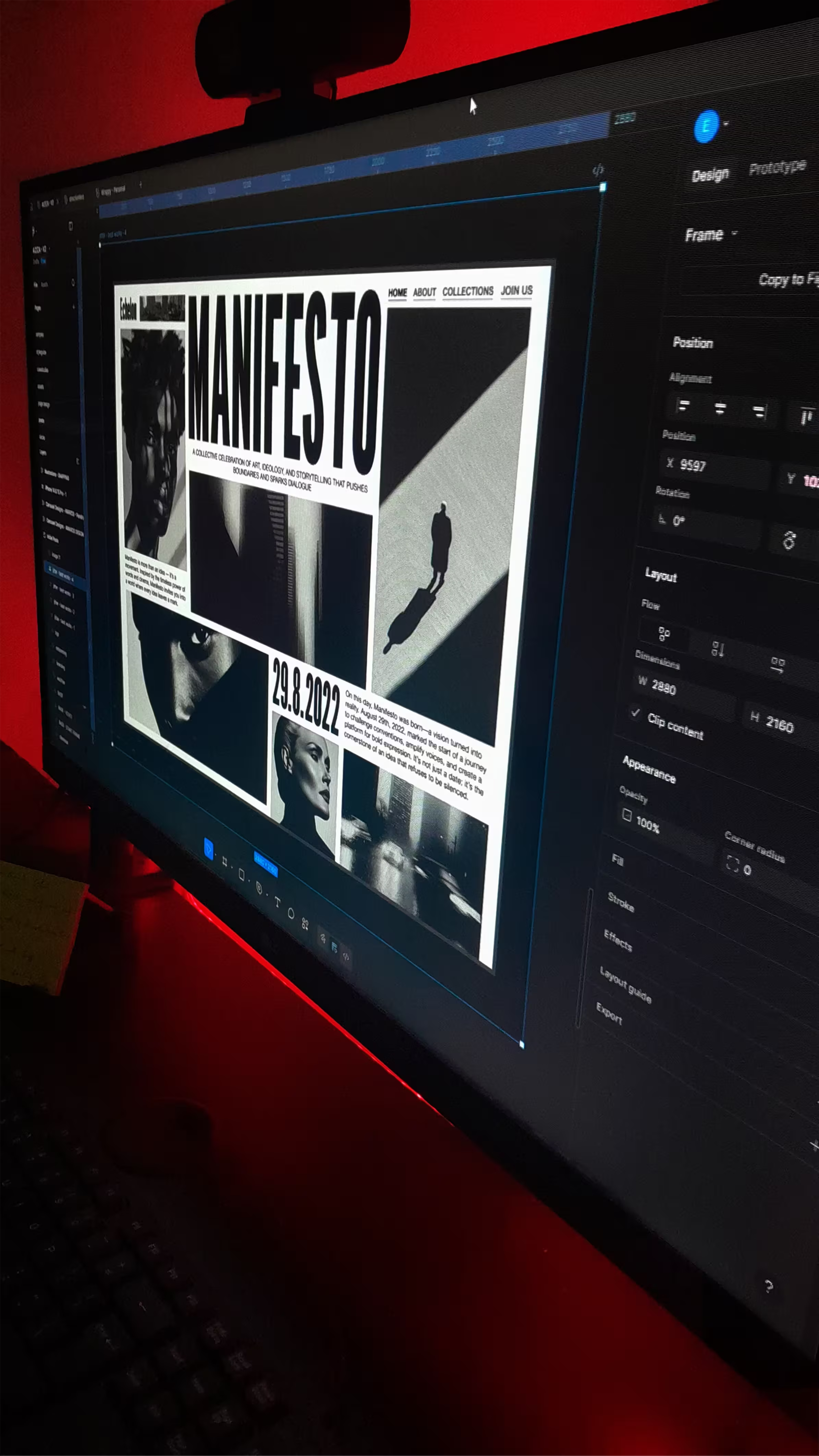
Order & Chaos is an experimental design series focused on pushing minimalism to its edge. Through rigid constraints in layout, typography, and color, the work explores how visual tension can coexist with clarity and restraint.
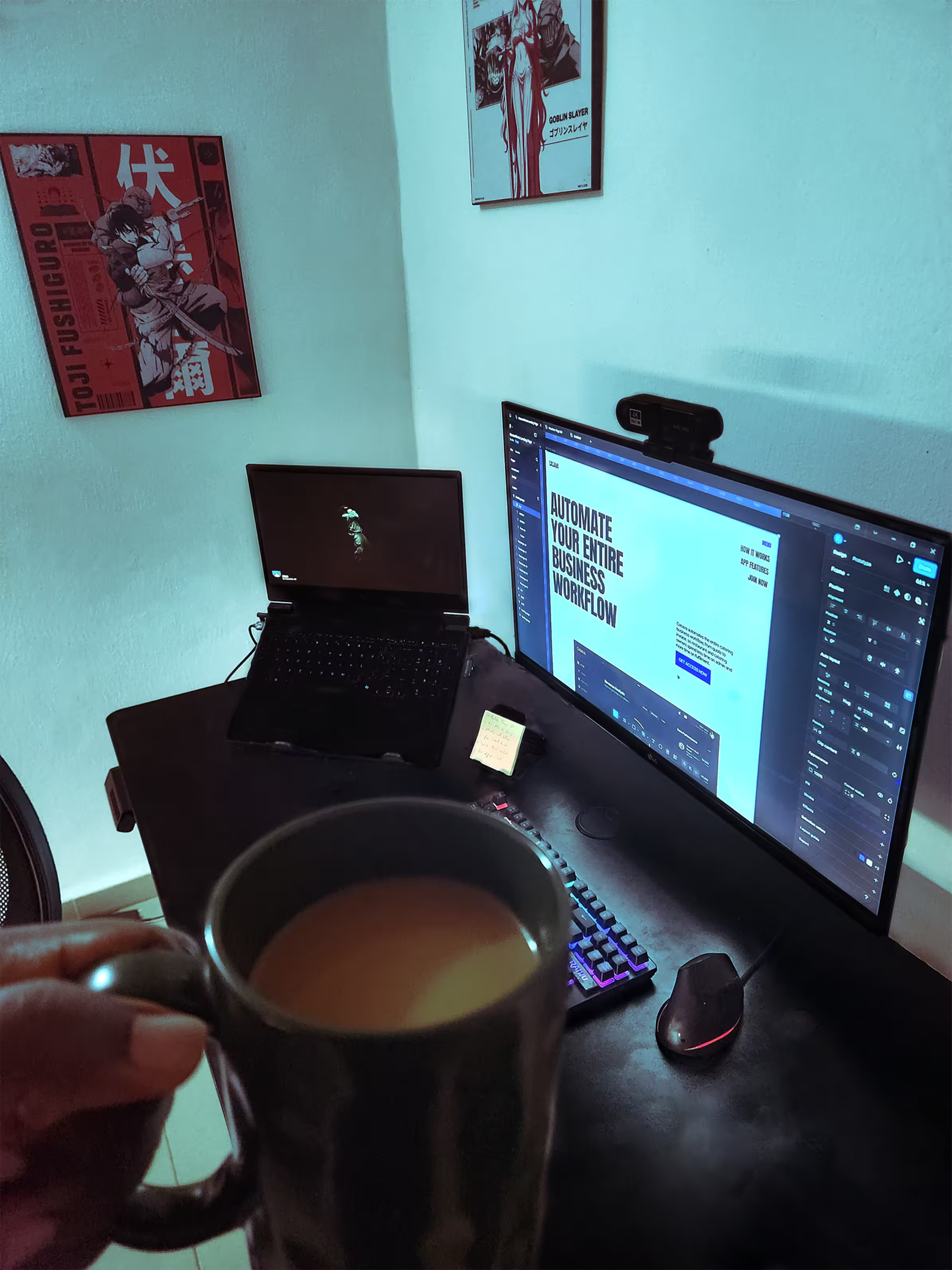
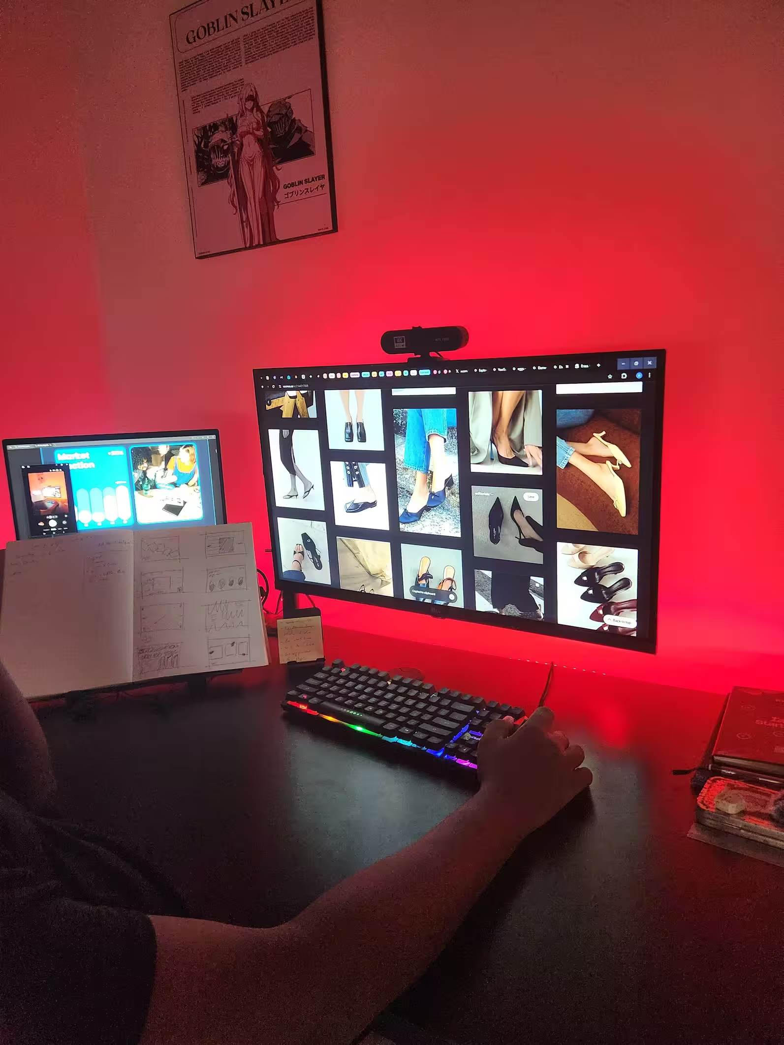
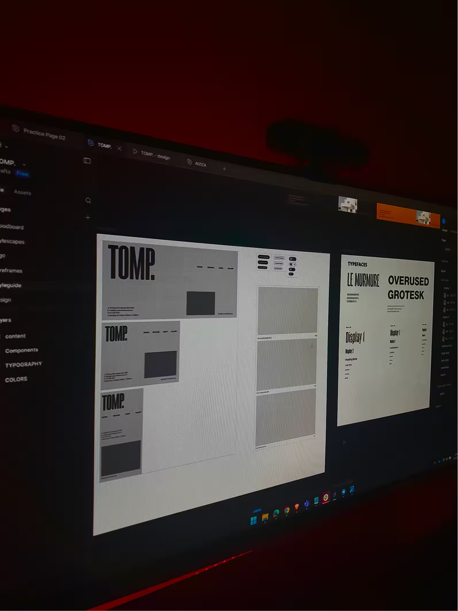
The main idea wasn't to make something fancy
It was to make something inevitable — create layouts where every decision feels like the only possible one.
Select Typefaces
We selected very few typefaces for the entire project in an attempt to mimic the limitations of a real world task.
3 Main Colors
Though you might find a few samples with differing colors, the main goal was to leverage only reds, whites and greys.
No Decorations
Keeping in the spirit of minimalism, we refrained from heavy decorations on most samples, sticking to few visual assets.
Each piece started on paper. Not as a sketch of the final layout, but as a set of propositions
If the type bleeds here, what does the image have to do? If the grid breaks at this point, can it recover?
Unconventional layouts work when they have a reason. Not a justification — a reason. There's a difference.
The series is done. Your version of it isn't.
Order & Chaos
An Experiment On
Layout & Expression
